
1/11/2023M MARKET’s MESSAGE: New UPTREND pops higher as major indexes close above the 50-day lines.
1/11/2023M MARKET’s MESSAGE: New UPTREND pops higher as major indexes close above the 50-day lines.

THE MARKET’s MESSAGE: Market in UPTREND

Wednesday was a “green” day across the board. The Nasdaq, S&P500 and DJIA all had significant rises in their prices and volume adding up to accumulation days! Accumulation is shown when the price and volume of a stock or index rise.
See the DAILY MARKET ACTION table below.
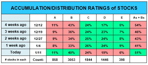
GOOD NEWS: Last week, there was a 10% rise in A + B stocks totaling 51% of all stocks. This abrupt gain shows the market is back in “buying”mode!
This table is not usually shown on page 1, but I will highlight it when its market message is important – and the last week’s 10% gain in A and B rated stock only occurs from serious, wide-spread stock buying.
MORE GOOD NEWS: The Market confirmed the new Uptrend last Friday and the Armchair Investor strategy bought the QQQ as fast as I could (at Monday’s open)and enjoyed Tuesday’s and Wednesday’s gains.
The Nasdaq and S&P500 are now above their 50-day moving average lines. The S&P500 is just 0.4% below its200-day m.a. line.

Could these rises above the indexes' 50-day m.a. lines signal the indexes have hit bottom and are now recovering? The economic news this week could help us determine if the markets are done with this Downtrend. (But I won’t start wide-spread buying until I see confirming market movement. But sampling a few stocks showing promise is OK.)
I have bought a full position in the QQQ. With the strength this market is showing, I will probably buy a couple of individual stocks on Thursday.
Stay tuned!

Note the number of Accumulation days has now match the number of Distribution days – a sign of the uptrend coming back into strength.

Four rising days in a row (1/6/23 to 1/11/23) show Uptrend strength - the first group of rising days in the last 20 days. These 4-days CONFIRM THE NEW UPTREND.
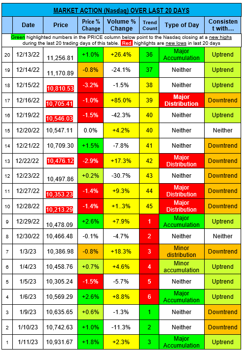
Note: The color of the Trend count column boxes tells you what type of market we’re in. Green confirms the market is in Uptrend.
· Green= Uptrend
· Yellow= Uptrend under pressure
· Red = Downtrend
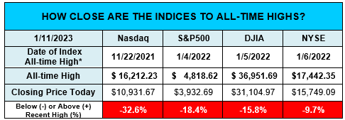
Not surprising: The major indexes are well below their all-time highs of about ayear ago as shown below.
Note the large number of days that closed at NEW LOWS (red highlighted prices) over these 20 days. This is what a DOWNTREND looks like. On Wall Street this period is frequently defined in red to represent the blood in the streets.
STOCK WATCHING: Send your suggestion on which stock to follow in this newsletter. I am looking for just one stock at a time, for training purposes.
>>>>>>>>>>>>>>>
Bets wishes for the New Year!
What will you create?
Charlotte Hudgin, The Armchair Investor, (214)995-6702
www.ArmchairInvestor.com (214)995-6702 editor@armchairinvestor.com
###
More Recent Posts
2024-02-15H: Nasdaq and S&P500 RISE Thursday but LOWER VOLUME resulted in No Accumulation day today!
Armchair Investor: 1/2/2024T After Monday's MAJOR +2.2% ACCUMULATION DAY, the market Held its Ground